Introduction
Our brand has two typefaces depending on the communication. The first and most important is our brand typeface Foco, it's distinctive and ownable. The other is our system font Calibri, which is purely functional and for use when our brand typeface isn't available.
Primary Typeface
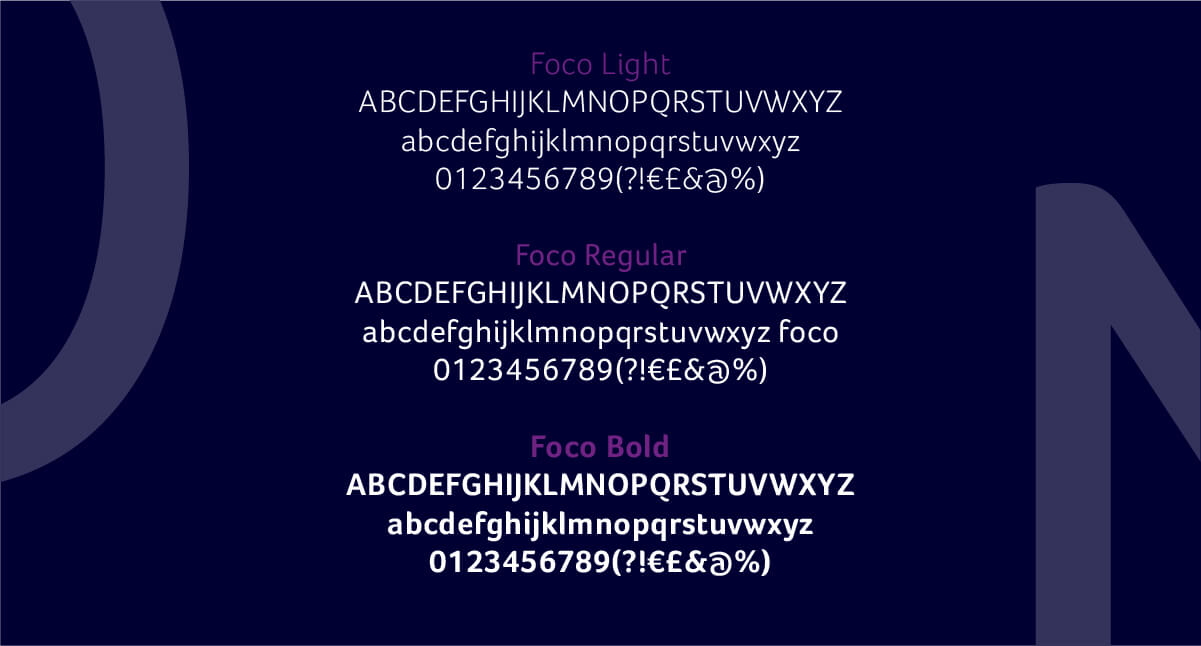
Our primary typeface is Foco. It's fluid, friendly and adds a sophisticated touch to communications when used in a lighter weight. The character's distinctive curves have an effortless synergy with the curves of the wordmark and the bird symbol.
Its harmonious proportions also deliver on legibility at small sizes, making it great for digital as well as print.
Download Foco here https://www.daltonmaag.com/foco
Ensure that you download / use the Light, Regular and Bold weights as recommended.
It's important that the right licence is purchased for specific usage. Further information about the different types of licensing is explained here https://www.daltonmaag.com/licensing


Recommended Weights
Our headlines and subheadlines should always be in capitals with a tracking of +80. This number should be consistent with any type size.
Ensure lowercase copy has a tracking of 0.
Type Styles Examples:
Headline: Foco Light, caps, tracking +80
Subheadline: Foco Light, caps, tracking +80
Capitalised title: Foco Bold, caps, tracking +80
Body copy: Foco Light, sentence case, tracking 0 (there should never be any tracking on body copy or sentence case copy)

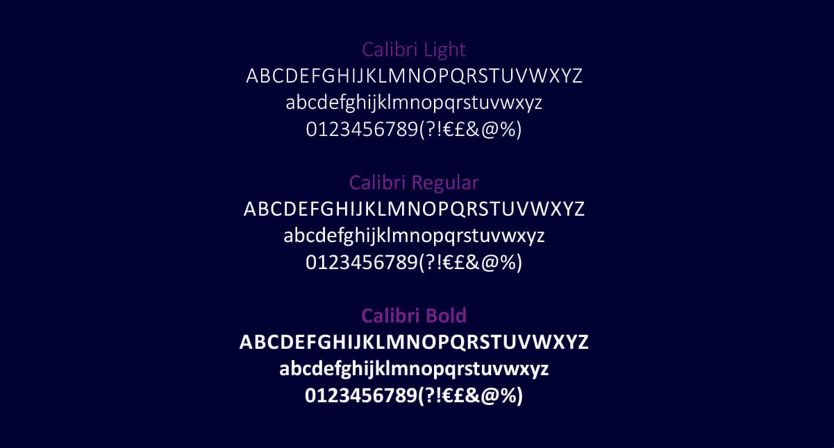
Secondary Typeface
Our secondary typeface is Calibri. It's a system typeface that is available on computers that have the Microsoft Package. It should be only be used when Foco isn't available, such as in Microsoft Powerpoint, Microsoft Word or for internal documents.