Introduction
Iconography plays a key role in our unspoken communications. They are used across multiple touch-points like the HMI charging station screens, as well as in digital and print communications.
Our Iconography style is simple yet highly functional. The pre-designed set of iconography is available to download here. Please respect them and do not alter them in anyway. They have all been designed on a set pixel grid using consistent stroke weights. So do not alter them in anyway.
The below are an example of the iconography style however the full set are available for download.
Download IONITY_Icons_Pink_RGB.zip
Download IONITY_Icons_White_RGB.zip
Download IONITY_Icons_Black_RGB.zip

Creating Additional Icons
When creating additional iconography it's important they follow the guides and dimensions below in order to visually match the existing set.
Our icons are created using an industry standard 64 x 64 pixel grid. The grid is also made up one large guide and one small guide to help create a consistent size.
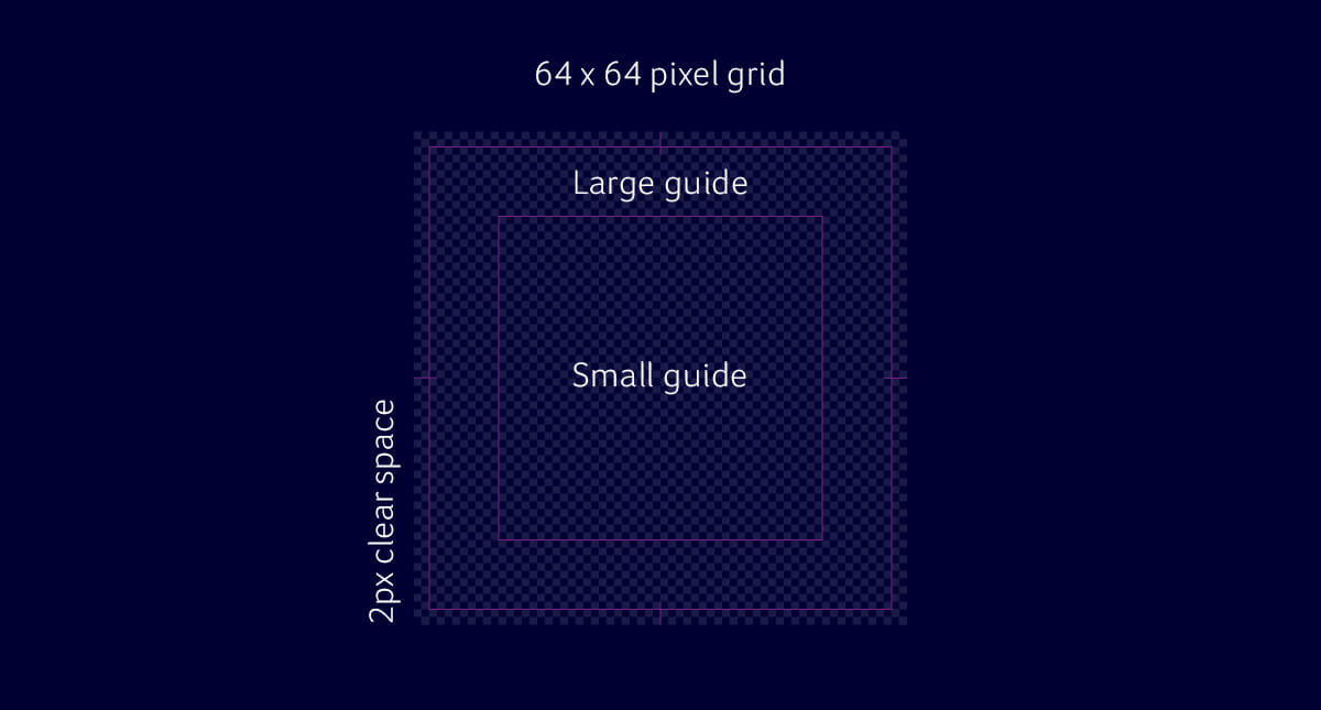
The smallest guide is used to centre all icons. This ensures all icons are the same height and align vertically when positioned together. The largest guide is for when icons are longer in length, where they should fit the width of the largest guide.

Each icon is made of two stroke weights. The thick stroke is 2px and the thin stroke is 1px. When creating any new icon, ensure both stroke weights are used, to create coherency.
The 2px stroke should be set to rounded corners and define the main icon. The 1px stroke should be used to add small details.
Download Iconography_Template.pdf
Animation Principles
When creating any animations, such as our thermal structures or iconography, the movement should be influenced by our thermal structures. Rather than a vertical or horizontal movement, we can own a rotational movement making our brand coherent and recognisable at every touch point.