Introduction
Our logo is our key identifier. The twist in the wings express the form and motion of our thermal structure brand properties creating a coherent brand. There are multiple versions of our logo to ensure maximum brand standout at every touchpoint. Best case examples outlining when to use each version will be defined in the 'Logo Usage' section.

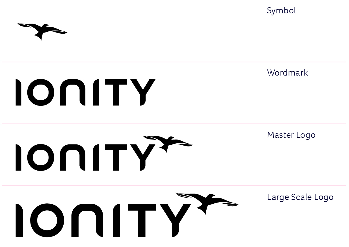
Master Logo
This white version is our master logo. It features the IONITY wordmark and the Redkite bird. It's a recognisable and visible brand asset, therefore it is vital that it's always applied consistently across all brand communications.
This logo should be used on all communications such as advertising, online, stationery and merchandise whenever possible.

Clear Space
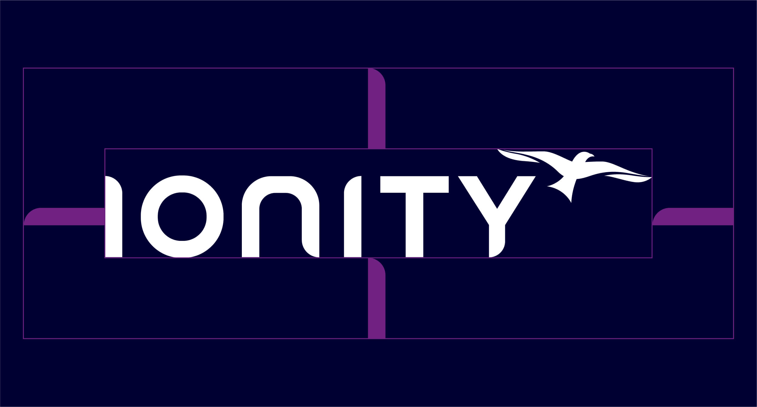
To ensure our logo has maximum stand out and is not obscured by any other design elements we recommend leaving a clear space the height of the I from IONITY around all four edges.
Minimum Size
Print – 25mm
Digital – 100px
Download Master Logo CMYK (Print).zip
Download Master Logo RGB (Screen).zip
Large Scale Logo
Our large-scale logo features more detail in the wings, enhancing the form and motion of our thermal current brand property. This version of the logo should only be used on large-scale communications such as out of home advertising.

Clear Space
To ensure our logo has maximum stand out and is not obscured by any other design elements we recommend leaving a clear space the height of the I from IONITY around all four edges.

Minimum Size
Print – 400mm
Digital – 700px
Download Large Scale Logo CMYK (Print).zip
Download Large Scale Logo RGB (Screen).zip
Wordmark
When the master logo doesn't meet the minimum size guidance or when there is clear space restriction we can use the stand alone wordmark.
Clear Space
To ensure our logo has maximum stand out and is not obscured by any other design elements we recommend leaving a clear space the height of the I from IONITY around all four edges.
Minimum Size
Print – 400mm
Digital – 700px

Download Wordmark CMYK (Print).zip
Download Wordmark RGB (Screen).zip
Symbol
The Redkite symbol can also be used in isolation. Typical examples of its use could be small applications such as merchandise or on secondary branded surfaces when the full logo is already present, such as the back of a brochure.

Clear Space
To ensure our redkite symbol has maximum stand out and is not obscured by any other design elements we recommend leaving a clear space 50% of the size of the symbol around all four edges.

Minimum Size
Print – 15mm
Digital – 45px
Download Symbol RGB (Screen).zip
Download Symbol CMYK (Print).zip
Colour Variations
We mostly use our white master logo on a navy background, however when this is not possible, our logos are also available in full colour – for use on a white or light background or in black – for when colour is not available.
Full Colour
One Colour – Black
Download Full Colour Gradient.zip
Download One Colour Black.zip
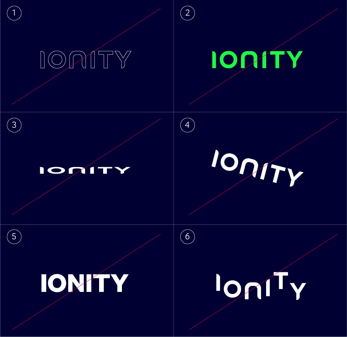
What Not To Do
Our IONITY logo (in all variations) is an important asset and should never be altered. Here are some rules to follow when working with our logos.
Master Logo
- Do not outline the logo
- Do not colour the logo
- Do not distort the logo
- Do not rotate the logo
- Do not change the font of the logo
- Do not reposition elements of the logo

Large Scale Logo
- Do not outline the logo
- Do not colour the logo
- Do not distort the logo
- Do not rotate the logo
- Do not change the font of the logo
- Do not reposition elements of the logo

Wordmark
- Do not outline the logo
- Do not colour the logo
- Do not distort the logo
- Do not rotate the logo
- Do not change the font of the logo
- Do not reposition elements of the logo
Symbol
- Do not outline the logo
- Do not colour the logo
- Do not distort the logo
- Do not rotate the logo
- Do not redraw the logo
- Do not reposition any elements of the logo

Logo Usage
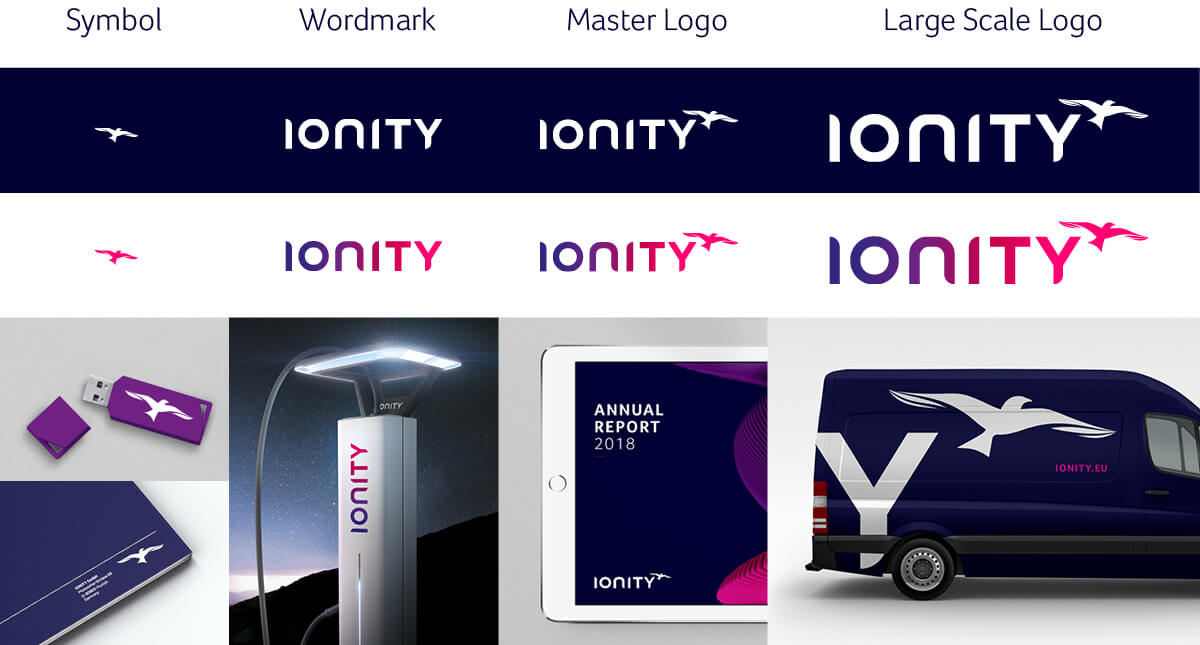
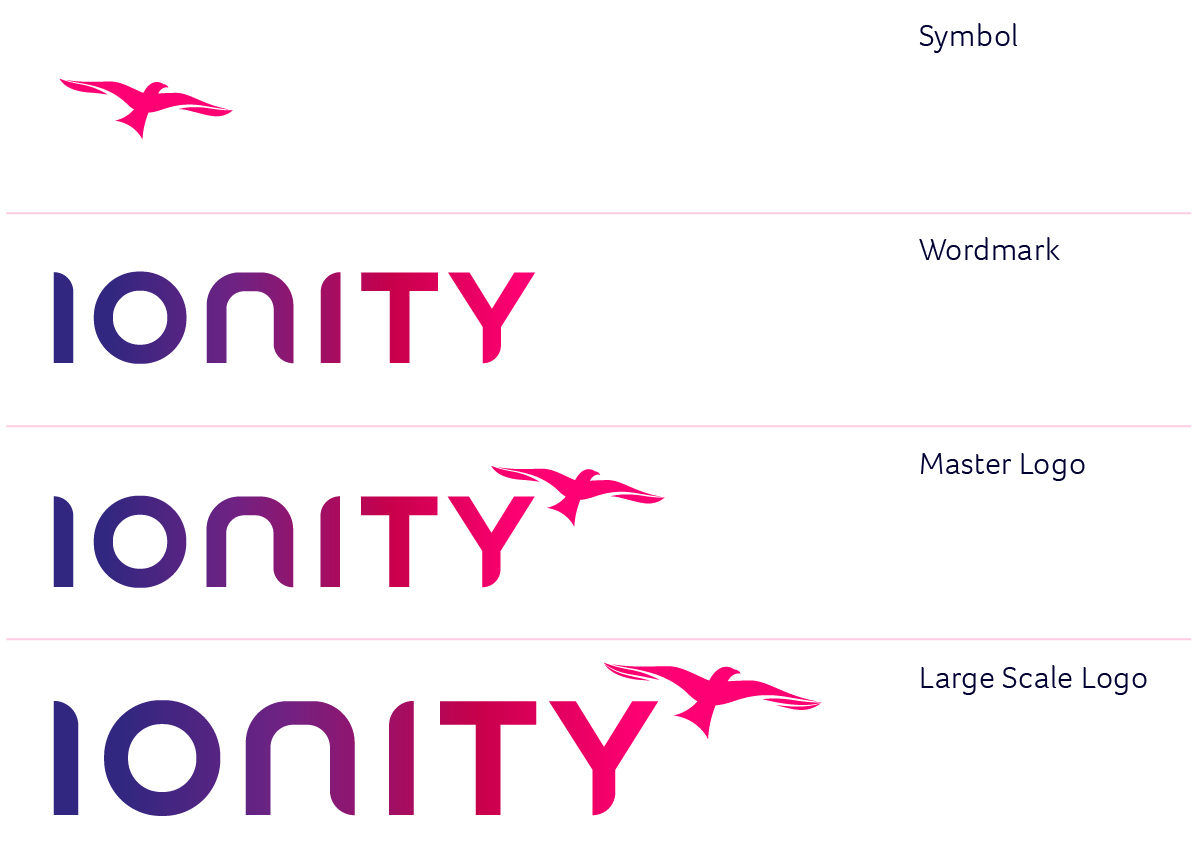
There are four variations of the IONITY logo. Each logo is better suited to certain communications to maximise the brand impact at each touchpoint.
Symbol: This can be used for small scale communications when space for our master logo is not permitted, or in a more playful way for example on merchandise.
Wordmark: This should be used in combination with other brands, such as co-branding on the charging stations, or when enough space for the master logo is not permitted.
Master logo: This should be used on all print and digital communications where ever possible.
Large Scale logo: This should only be used on large-scale communications such as out of home advertising, where extra detail of the birds wings are clearly visible.