Introduction
Our brand identity is brought to life through the use of our thermal structure brand property. These allow us to tell the story of IONITY and create a distinctive and modern brand.
Our thermal structures are based on the physics of thermal wind currents and the way that birds use these to effortlessly maximise their flight. We also use this as a metaphor for the effortless lift that IONITY provides.

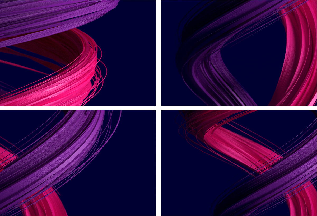
Thermal Structure A
Thermal Structure A symbolises the freedom, effortlessness and ease of using IONITY. For illustration purposes the structure has been shown in full below, however in a real context it should always be cropped.

The structure should always be cropped when used. Interesting crops should be chosen to capture the idea of movement and rotation (see examples below). Ensure both colours are visible in every crop.
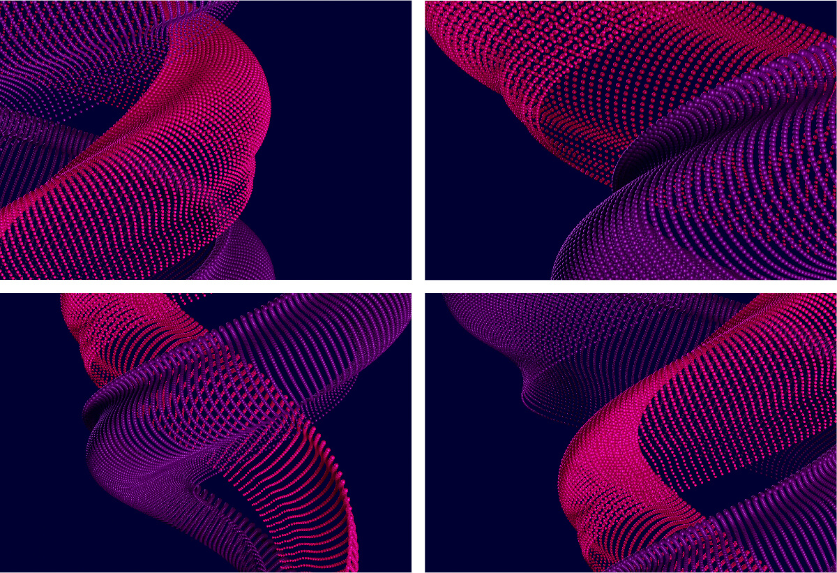
Thermal Structure B
Thermal Structure B symbolises both the speed and digital aspects of IONITY. For illustration purposes the structure has been shown in full below, however in a real context it should always be cropped.

The structure should always be cropped when used. Interesting crops should be chosen to capture the idea of movement and rotation (see examples below). Ensure both colours are visible in every crop.
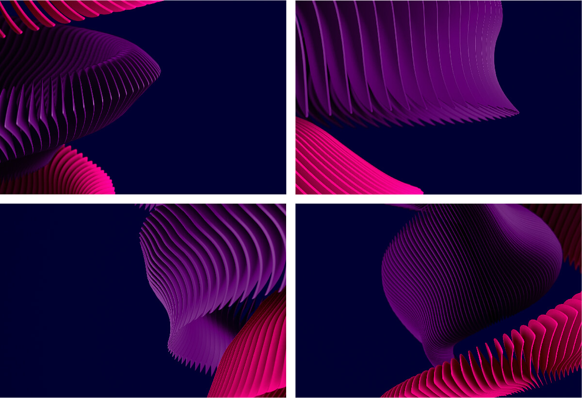
Thermal Structure C
Thermal Structure C symbolises the flexibility and step-by-step nature of IONITY. For illustration purposes the structure has been shown in full below, however, in a real context it should always be cropped.

The structure should always be cropped when used. Interesting crops should be chosen to capture the idea of movement and rotation (see examples below). Ensure both colours are visible in every crop.
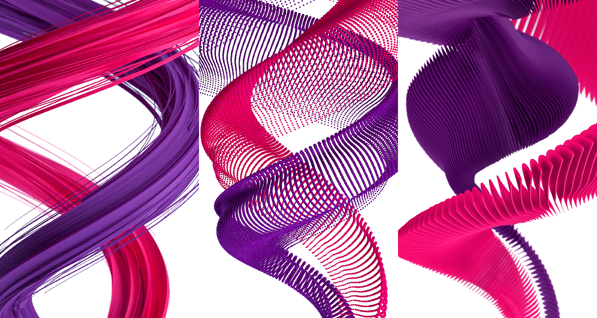
Colour Variations – Full Colour On White Background
When our master thermal structures (with a navy background) are not appropriate there is a full colour version on a white background. This might be more appropriate in cases such as the cover/divider slides of a Powerpoint presentations where they frequently be printed.
Colour Variations – Watermark
When our full colour thermal structures (with a navy or white background) are not appropriate the watermark version of our thermal structures is available and is more subtle. This is for when we dial our brand down and allow content to be the focus. There is no set scale, so the thermal structures can be scaled up and down or be cropped into to best suit the image and composition.

What Not To Do
It's important the appearance of our brand and brand assets remains consistent to maximise brand impact at all touch points. For that reason ensure the correct usage for each asset.
- Do not stretch or distort our thermal structures
- Do not use multiple thermal structures on one communication
- Do not rotate the thermal structures
- Do not try to recreate our thermal structures
- Do not use our full colour thermal structures with photography
- Do not use our thermal structures in full (always crop into them)
Please note: the above guidance should be applied to all thermal structures – A, B and C.

Thermal Structures Usage
Our thermal structures are available in multiple versions to best suit particular applications. The easiest way to determine when to use each, is to divide the versions into primary and secondary branded surfaces.
A primary branded surface is any touchpoint that the viewer first comes in contact with the brand.
For example out of home advertising, online, the opening slide of a Microsoft Powerpoint or the cover of a brochure.
These should have maximum brand impact. Use the full colour version on a navy or white background. Alternatively if we are partnering with another brand use the editable template. Update: editable partner templates are no longer used.
A secondary branded surface is any touch points where the viewer is already familiar with the brand.
For example the inside of a brochure, the secondary pages of the website or the reverse of a business card.
These touch points will have less brand impact as the viewer is already aware of the brand and we don't need to be dialled up all the time.
Our flexible brand assets and approach enables coherent applications. The below examples are our recommended.
