Partner Co-Branding
A large part of our brand involves teaming up with other brands to provide the best service for our customers. Due to our flexible and coherent approach the following sections map out our relationship on a variety of different touch points.
The following visual examples uses Brand A (Partner) and Brand B (IONITY) as a way to differentiate between the two partnering brands.
Totem
When branding totems these will usually lead with the partner brand, however there is no set rule, the space that each brand will occupy will differ and be determined by the individual brands.

Forecourt
Our forecourt co-branding should always be split 50/50, however there are two options depending on the partner requirements.
Option 1
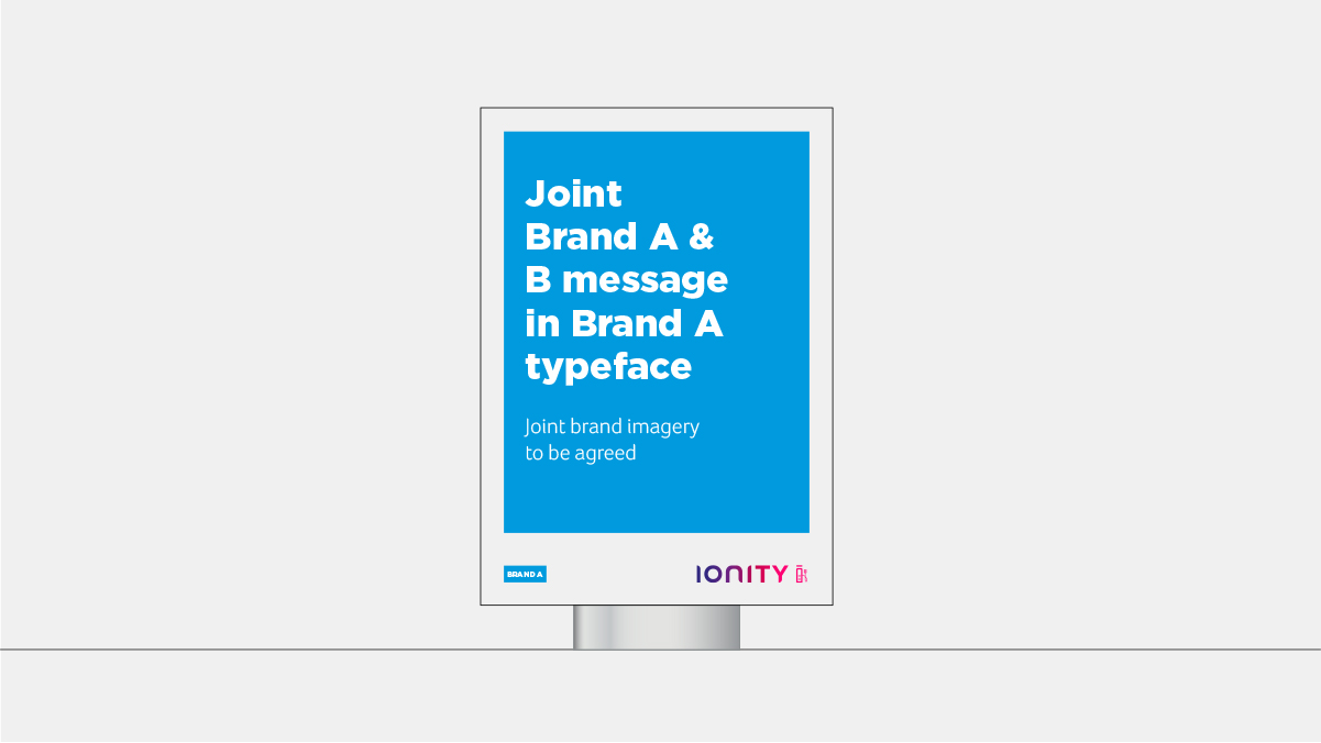
This communication will come from the Partner brand. The message will be joint, but will be visually represented in the partners typeface, along with the imagery that will be jointly agreed.
Option 2
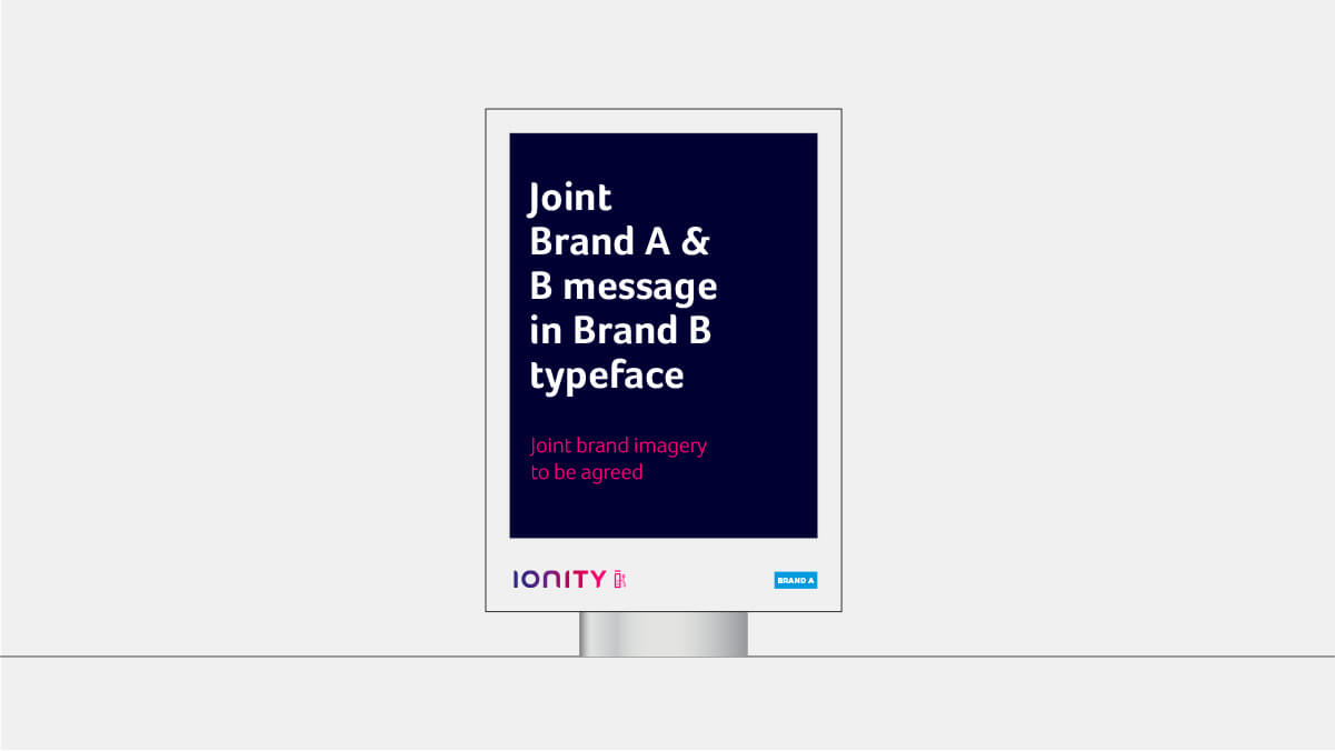
This communication will come from IONITY. The message will be joint, but will be visually represented in the IONITY typeface, along with the imagery that will be jointly agreed.
Navigation
There are two options when branding the navigation signage.
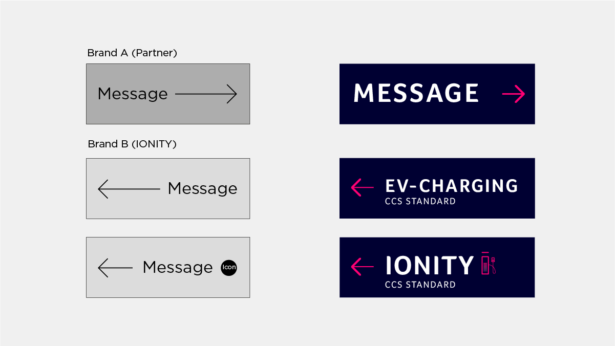
Option 1
The visual look and feel is the partner brands identity. I.e the partner colour palette, the partner brand typeface

Option 2
The visual look and feel is IONITY. I.e our colour palette, our typeface and our iconography style.
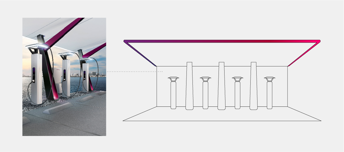
Pilot Charging Station
Pilot charging stations are simply co-branded 50/50 with the IONITY logo and the partner brand.

Charging Station
The site partners can choose wether to be represented on the display or on the hardware.
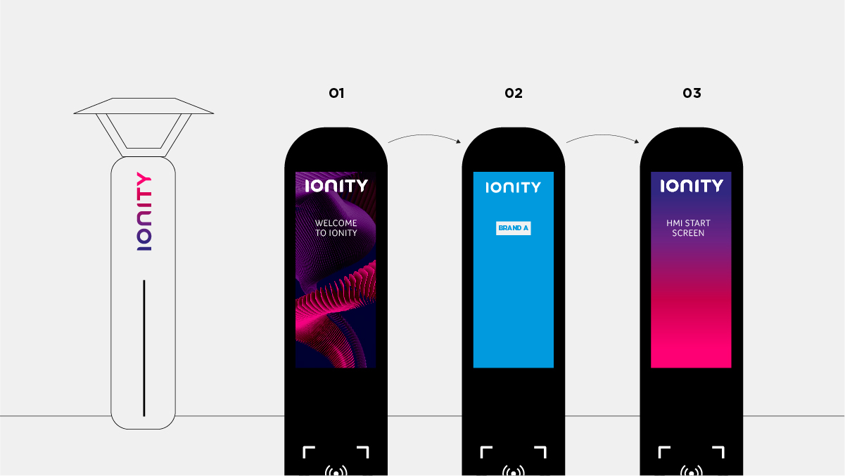
Represented on the display (Hardware – IONITY only)

Option 1
IONITY is represented on the hardware and on the welcome screen (01). The partner brand is represented on screen 02 before transitioning back to the IONITY branded screen (03).
Option 2
IONITY is represented on the hardware and both IONITY and the partner brand are represented on the welcome screen (O1). The IONITY Thermal Structures adopt the colours of the partner brand. Screen 02 then transitions to the IONITY HMI start screen.

Represented on the hardware (HMI Display IONITY only)
The partner brand is represented on the hardware, whilst IONITY is represented on the HMI screens. The balance of the IONITY logo and the partner logo should be 50/50.

Charging Station Court
There are two options to brand the charging station court.
Option 1
When the site partner approves the IONITY branding on the canopy, or when there is an absence of a co-branding agreement.
Option 2
When the site partner doesn’t approve of the IONITY branding on the canopy, the canopy will appear as a white light.

Co-Branding Communications
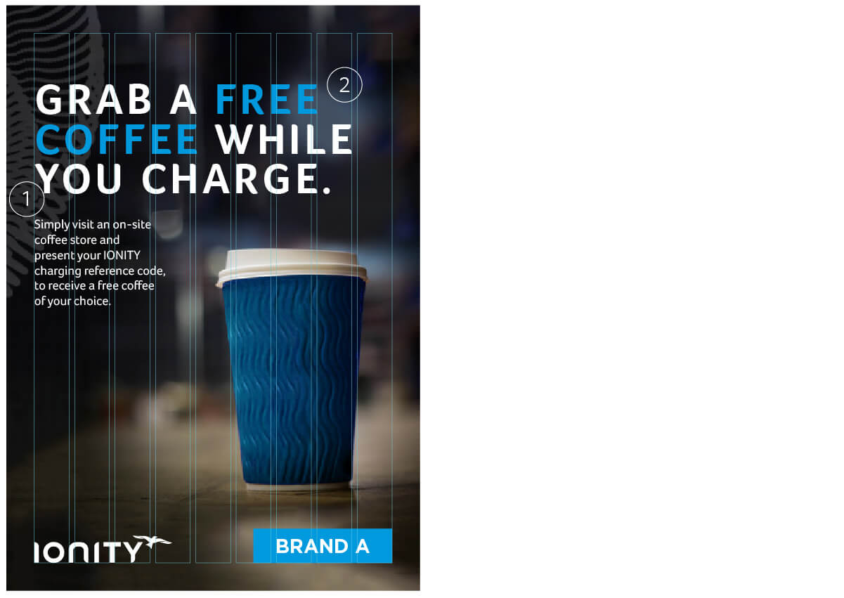
Co-Branding 01
Joint agreed message in the partner brands typeface with IONITY Watermark Thermal Structure over joint agreed imagery.
1. Headline & Body Copy:
Headline – Headlines should be joint agreed by IONITY and the partner brand and should use IONITY brands font.
Foco Bold, Caps, Tracking +80 (for all sizes)
Body:
Foco light/regular, Sentence case, Tracking 0
2. Colour:
The partner brands colour palette can be used within the headline to highlight key information.
This second version below follows the guidance of the first version above but with the following exceptions:
Co-Branding Portrait 02 – Specifications
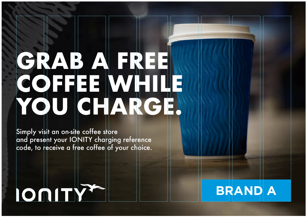
The landscape format follows the guidance of the portrait format.
Co-Branding Landscape 01 – Specifications
1. Gradient Panel:
To ensure headlines and copy have maximum standout a black and white gradient box (with black at the top and white at the bottom) should be set to 'Multiply' and placed behind the copy and on top of the imagery.
2. Thermal Structure:
The Watermark Thermal Structure A, B or C can be positioned over photography and set to a ‘Blending Mode’ and ‘Opacity’ that feels natural and least distracting. This makes photography and the communication ownable yet allows the copy and images to lead.
3. Headline & Body Copy:
Headlines should be joint agreed by IONITY and the partner brand, and all copy should use the partner brands font.
4. Logo Positioning:
IONITY logo – The IONITY logo should always be positioned bottom left and in white
Partner logo – The partner logo should always be positioned bottom right and in white
5. Margin & Grid:
Margin (For an A1 communication Margins) – 40mm
Gutter – 8mm
Grid – Our 9 column grid provides flexibility whilst allowing content to be structured and aligned when needed
6. Imagery:
Imagery should be joint agreed by IONITY and the partner brand.
7. Logo Size Relationship:
The IONITY logo should occupy 3.5 columns in width. The partner logo should be equal in balance and visual prominence to the IONITY logo. If a partner logo is shorter or taller than the IONITY logo it will require the logo to be increased in size to achieve an equal visual balance.
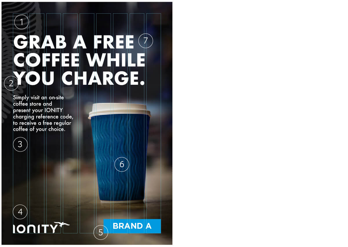
Co-Branding Portrait 01 – Specifications

Co-Branding 02
Joint agreed message in IONITY typeface with addition of the partner brand's colour palette, with IONITY Watermark Thermal Structure over joint agreed imagery.

There are two ways to create communications when partnering with other brands. These version have a subtle difference.
Images are to be joint agreed by the two partnering brands, and are branded with the IONITY Watermark Thermal Currents. Logos are set to specific positions, and the typography is the subtle difference.
Co-Branding Portrait 02 – Specifications
The landscape format follows the guidance of the portrait format with the exception of the below.

1. Colour:
The partner brands colour palette can be used within the headline to highlight key information.